Table of contents
PDP CRO for selling clothes and gear
Overview 📰
Analysed the competition and improved the product details page to suit different types of products.
Outcome 🎯
Optimized the PDP template for visually-driven products and specs-driven products.
Background & problems
🤔 The PDP - clothing and gear - before any design changes.
This task was but a glimpse at the massive amount of work planned for this e-commerce website. The client was struggling to speak to their two types of main customers, within the same page: those who buy gear and those who buy clothes for hiking. Both of these types of products have specs that people are searching for.
But, shopping for clothing is not the same as shopping for gear: the former needs to be visual and focus on the material while the latter needs to be seen in context and focus on the functionality.
As such, the main problems we had to tackle were:
01
How can we use the same PDP two product-types?
02
How can we increase delight and the add to cart rate?
03
How can we ship this fast and with minimal effort?
Design process & solutions
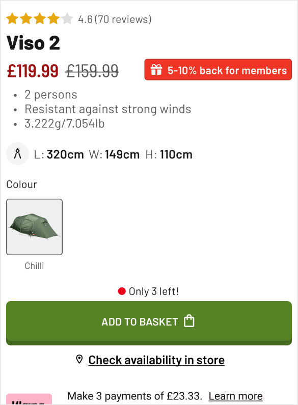
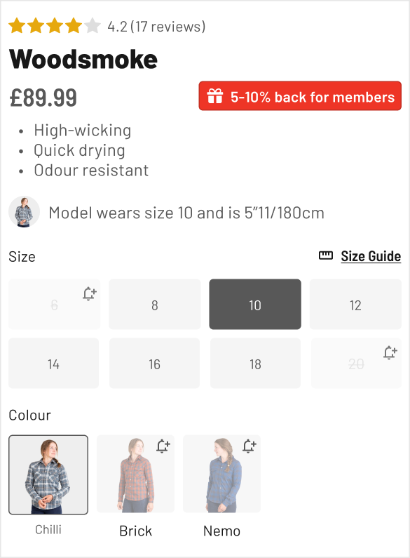
💡 Added the most important details above the fold to be scanned at glance. Incentivized with a discount and made the main CTA feel satisfying to press.
Enhancing the above the fold part was the first thing to start with. It wasn't delivering as much value as it could - and the client had tons to give.
Then, some incentives were missing from the picture: they had a low hanging fruit of inviting people to create an account and get between 5-10% back on orders depending on how much they spend.
Also, they had the important info e.g shipping info and cost, product features and USPs but you had to read a bunch of text to be aware of them: nobody wants that while shopping. A quick fix with icons, then we top that with upsells and we've got a much better PDP already!
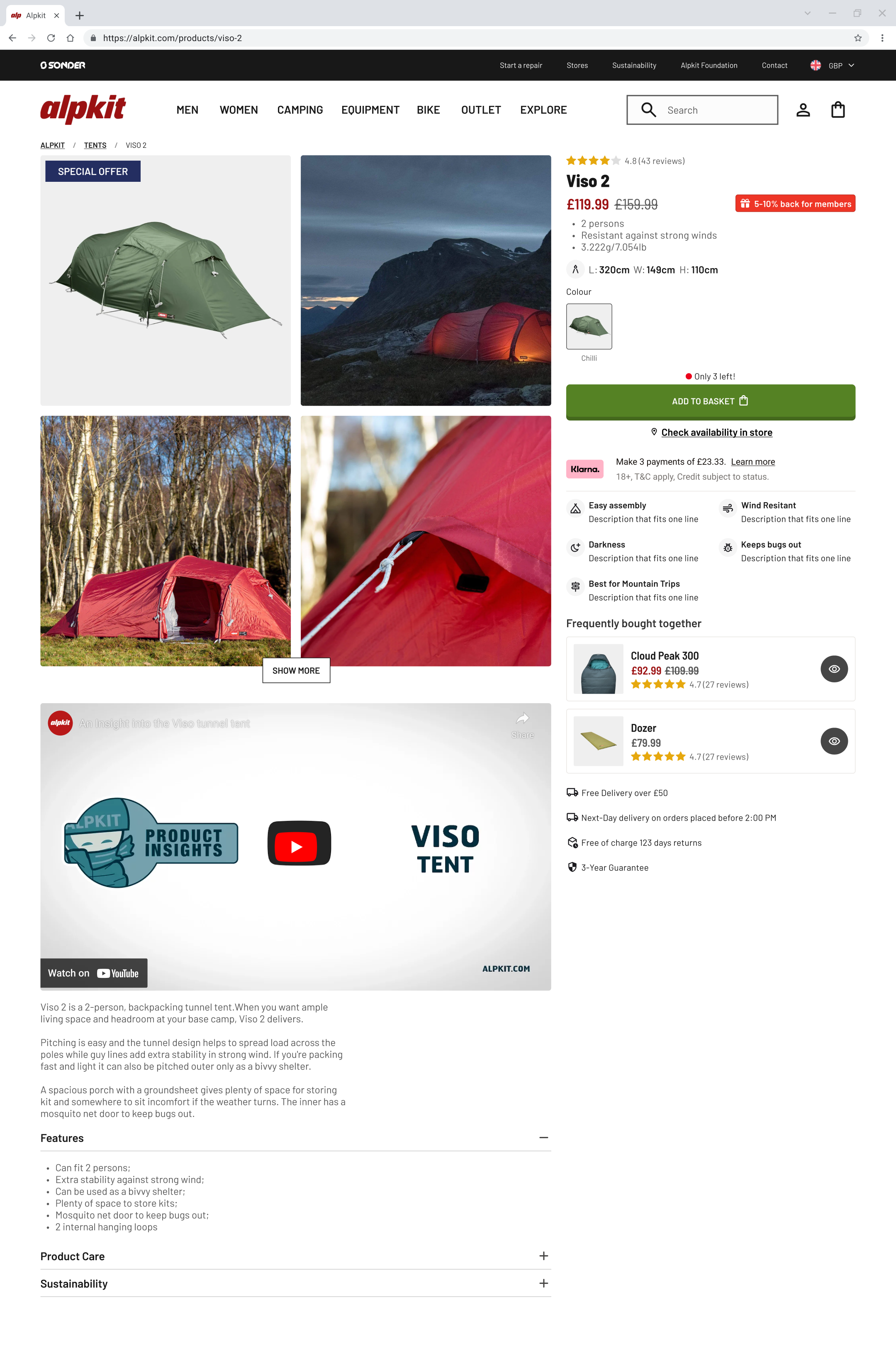
🧗 Gear template
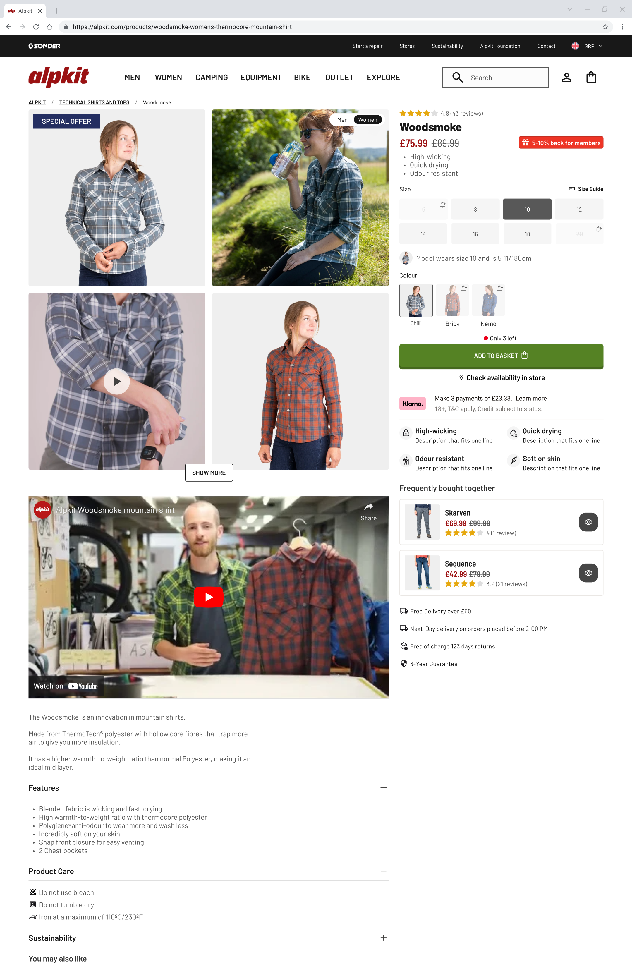
👕 Clothing template
Competitive analysis
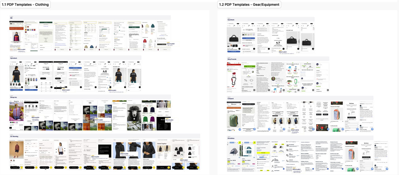
📸 I used a chrome extension to capture shots of other PDPs and jotted down ideas for inspiration.
I have spent roughly half a day on the whole task. Started from studying what the competition was doing at the time. Gathered screenshots of their PDP and noted what ideas came to mind.
I had observed a few things: for clothing, based on my experience of being 6'3, it is difficult to really know if an item will fit - especially pants... Sure, the size guide does a good job, yet not every piece of clothing is the same - and little details matter.
Because of this, it made sense to help customers know what size fits them by displaying the model's measurements e.g. height and size worn, as a reference.
This potentially reduces the return-rates as well: have you ever worn something from a friend that was just as tall as you were? Chances are you did, it suited you well, and you didn't want to give it back.
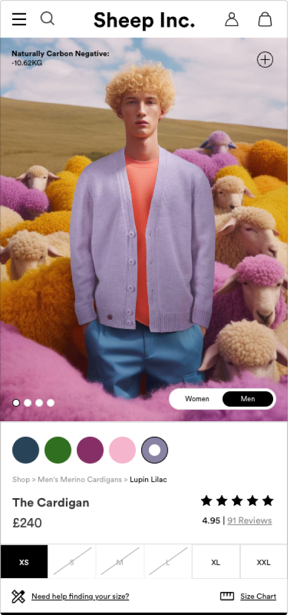
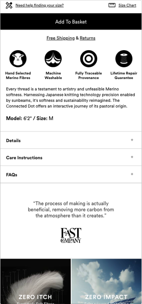
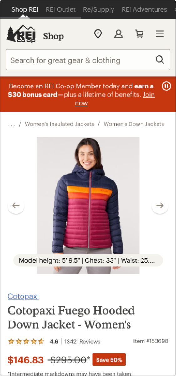
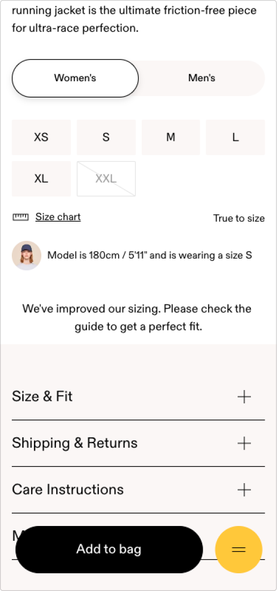
The same reference applied to gear as well. It became evident that, for example, when choosing to buy a tent, you'd need to know if, for example, you and your friend(s) would have enough room.
The same e-commerce shops I took a look at were providing measurements for the pieces of gear they were selling, which made it easier to comprehend if the product was right for you should keep looking.
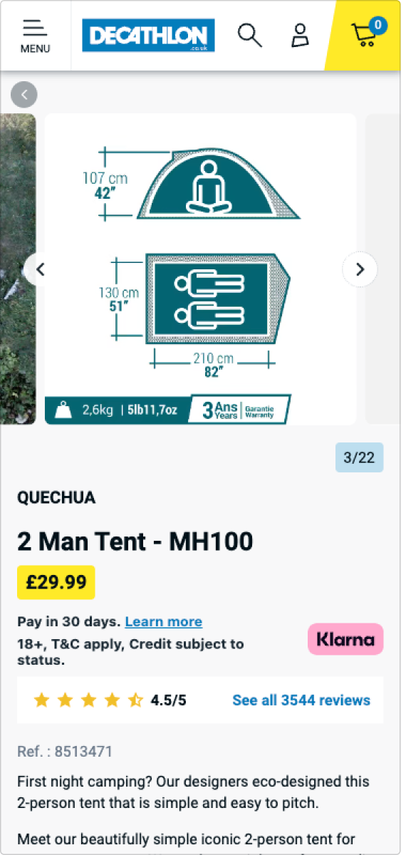
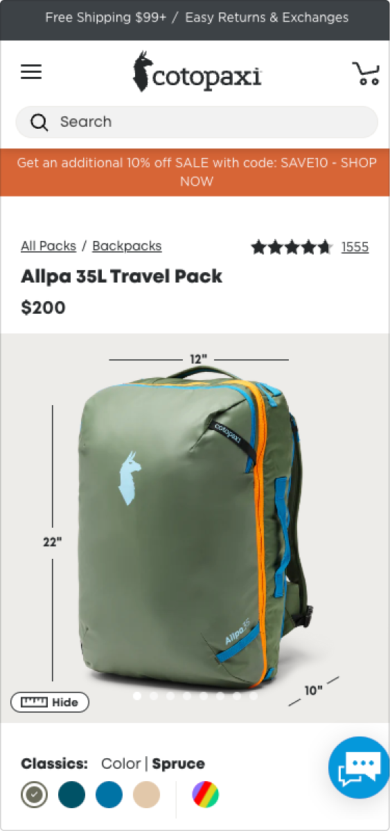
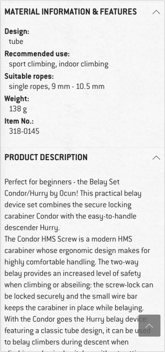
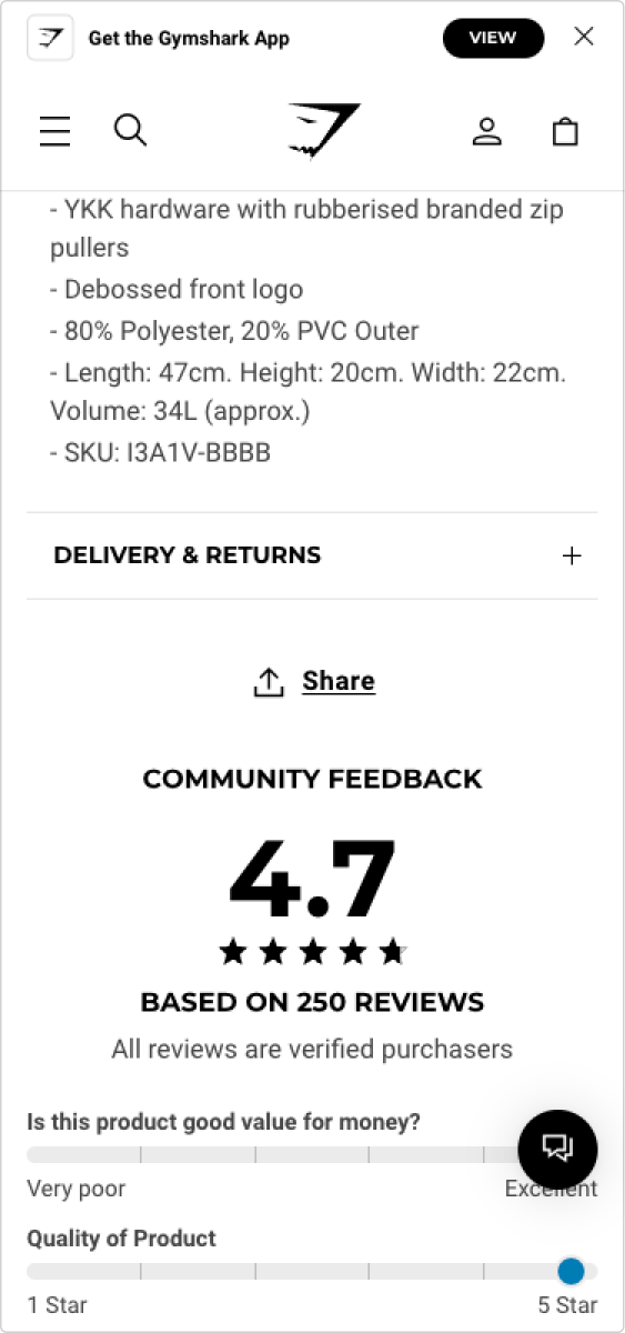
As such, with all this inspiration gathered pretty quickly, my knowledge on best practices and about the customer it was enough to know that a few things would suffice to optimize this PDP.
In the design phase, I had received constant feedback from my lead, who has been of tremendous help in getting the most out of the available space and making sure the incentives were attractive.
Thumbnail pictures that *pop*
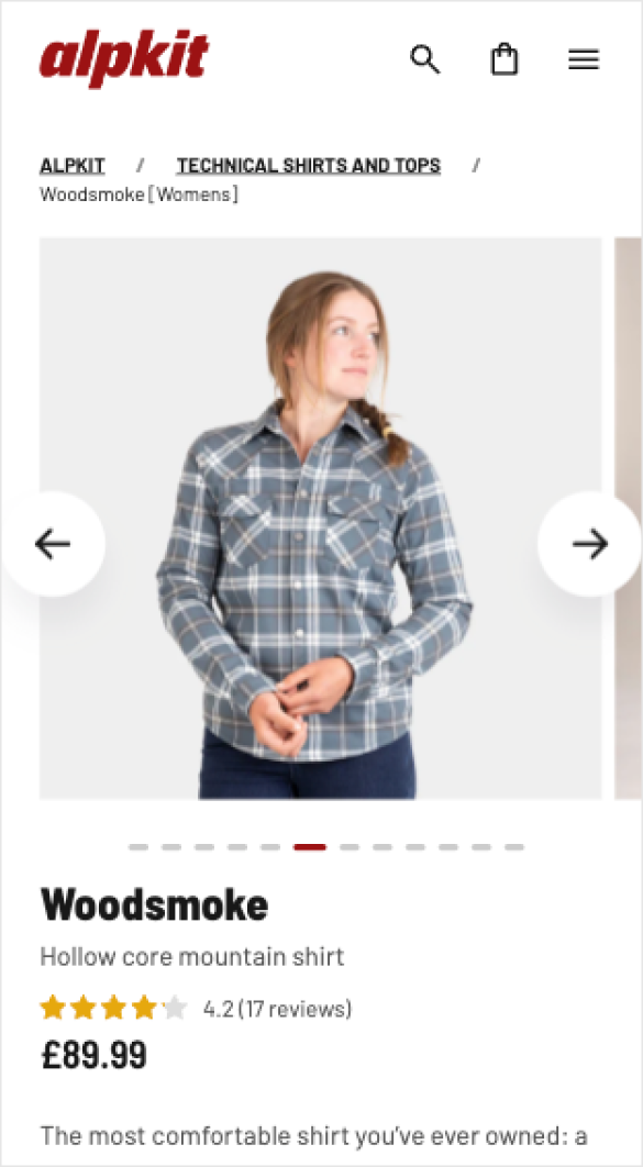
Before
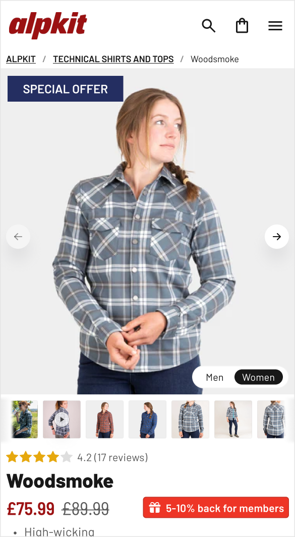
After
If you ever shopped online for more than 30 minutes, then you know that images are what you go to in order to understand the product.
More so for fashion, where seeing the item being worn in different occasions and positions makes a huge difference. Now, even though these picture were available, you had no way of previewing them, which just made you hope that after all that scrolling you'd be doing, you'd find what you want. If you didn't, that was a disappointment which probably lowered the site's value in your eyes.
To prevent this and offer more at first glance - we're above the fold after all - the thumbnail had to take all the available horizontal space. The arrows had to be made smaller - no one has fingers that small - and the indicator to be replaced by the images contained in the gallery.
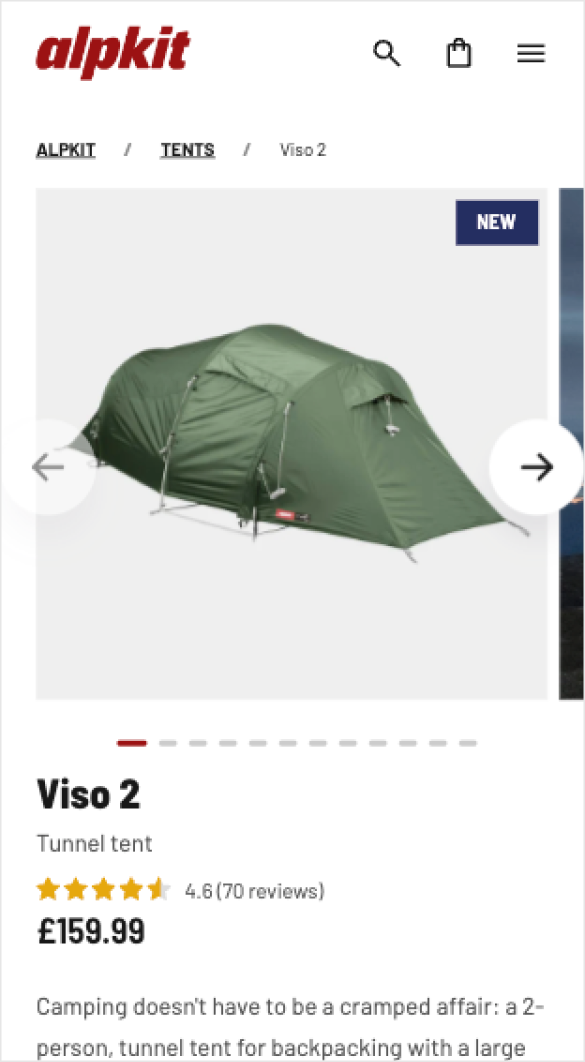
Before
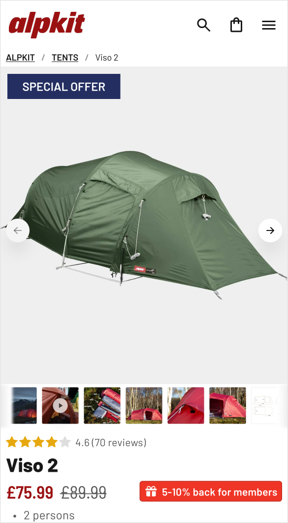
After
From a wall of text to snacks of value
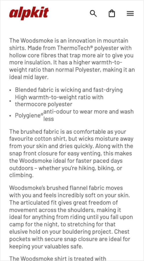
Before
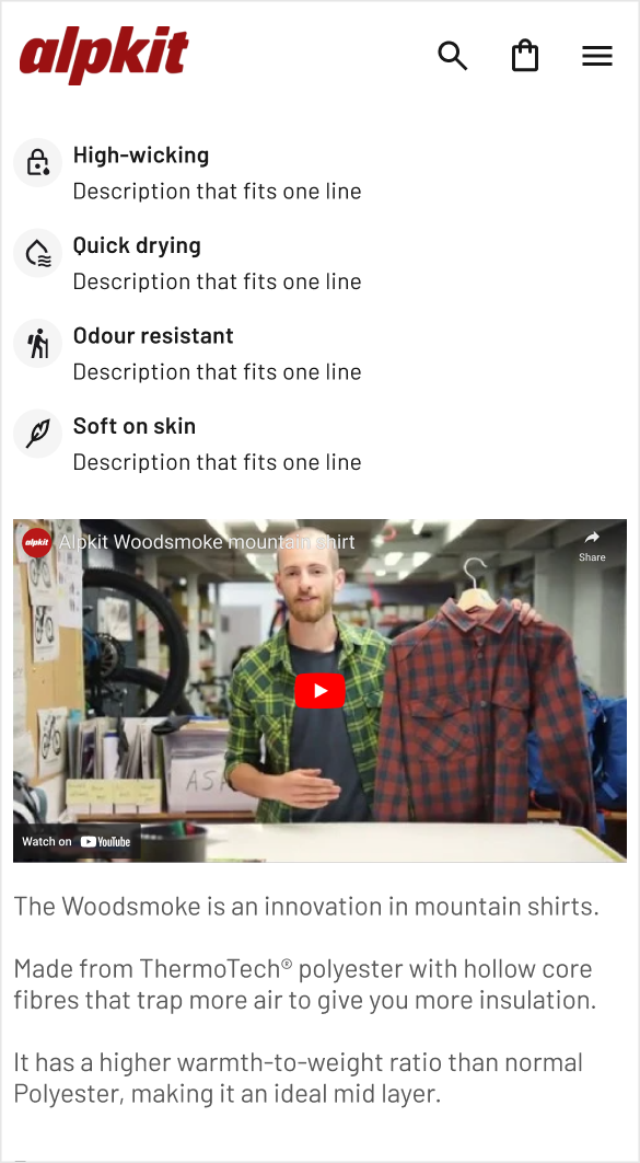
After
Next on, giving this wall of text an actual voice wasn't possible without a better layout. At the same time, the amount of work that was put into these descriptions isn't something that stakeholders give up easily.
The main risks I saw with leaving it untouched was that you could have a customer:
(a) not being conscious that this product has what they are searching for e.g. odour resistance - because they don't want to read;
(b) wondering wether or not its worth doing all that reading at all if the image gallery didn't persuade enough and;
(c) even do take the time to read it, only to be left disappointed because its not what they want.
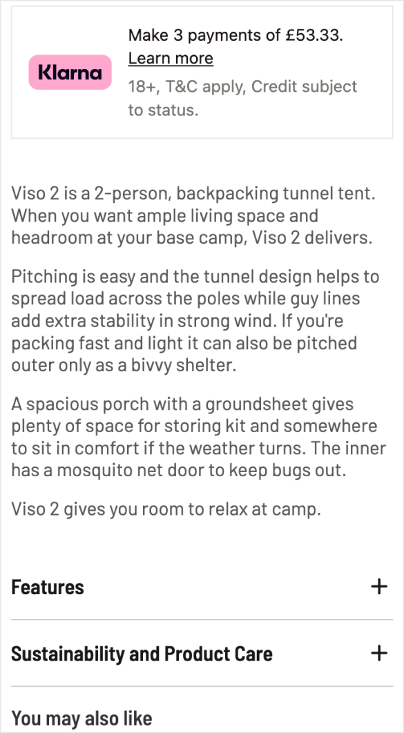
Before
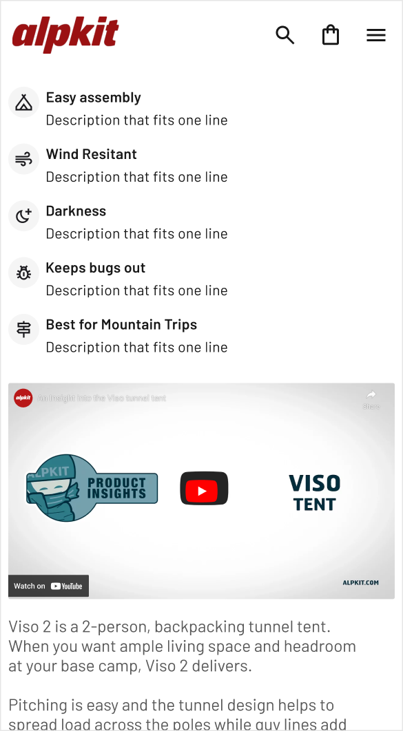
After
Incentives and delight blended together
'Add to cart' area
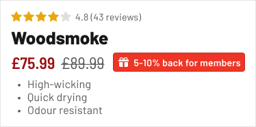
Product summary
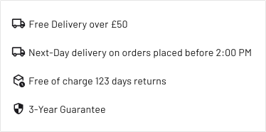
Policy info
With the images receiving the help they need and the important info redone to be easily read even by a 6th grader, some beautifying was the cherry on top - after the cross-sell, of course.
Duolingo knew what they were doing when creating those sexy buttons: they nudge you to click them and leave you satisfied right after.
This makes the shopping experience delightful. On top of that, incentives flagged in key places, such as the "5-10% back" offer being next to the price, priming the customer to create an account and receive further offers via e-mail - if consent is given, of course and the low-stock indicator sitting next to the add to cart, creating a sense of urgency due to scarce resources.
Furthermore, the policy-related information e.g. delivery costs and guarantees are outlined in short, addressing common doubts about hidden costs.
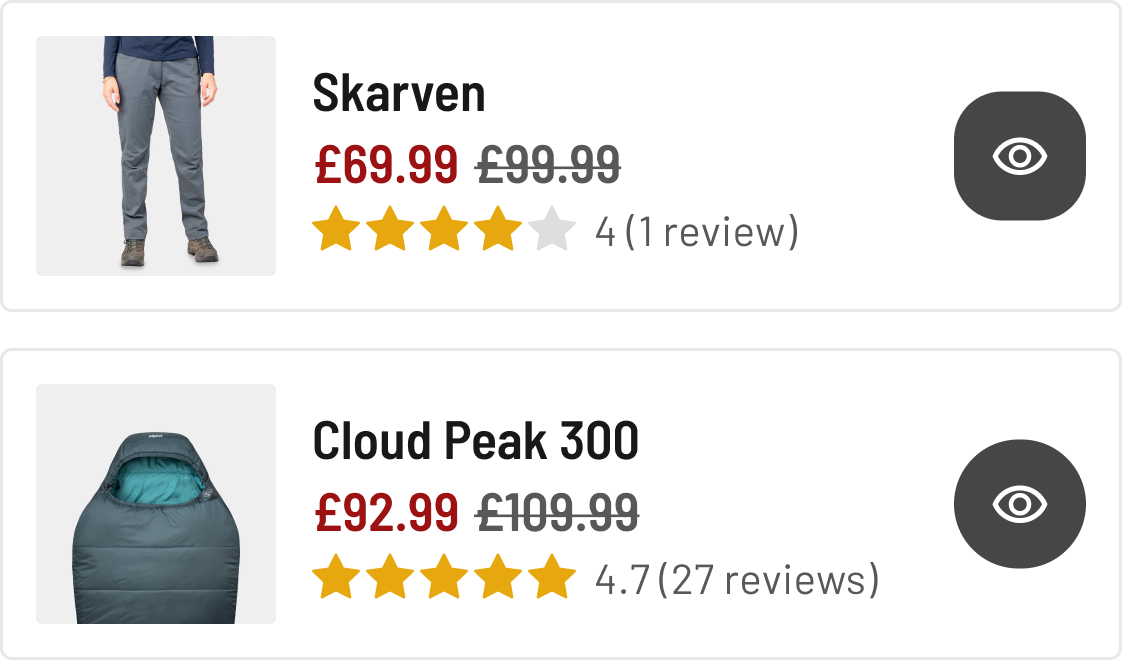
Cross-selling
Another detail you might've seen was that I had removed the quantity selector - this was a great suggestion I received from my design lead - since this is usually considered when the client is reviewing their cart.
At least, while there were default cross-sells coming from Shopify, their UI was taking a lot of space and you couldn't see the details of these products unless you went to their individual PDP - which was extra effort we avoided by adding a "quick view" button.
Now the customer had everything they needed, PDP-wise, to decide wether or not they should proceed adding this to their cart and consider purchasing.
Outcome
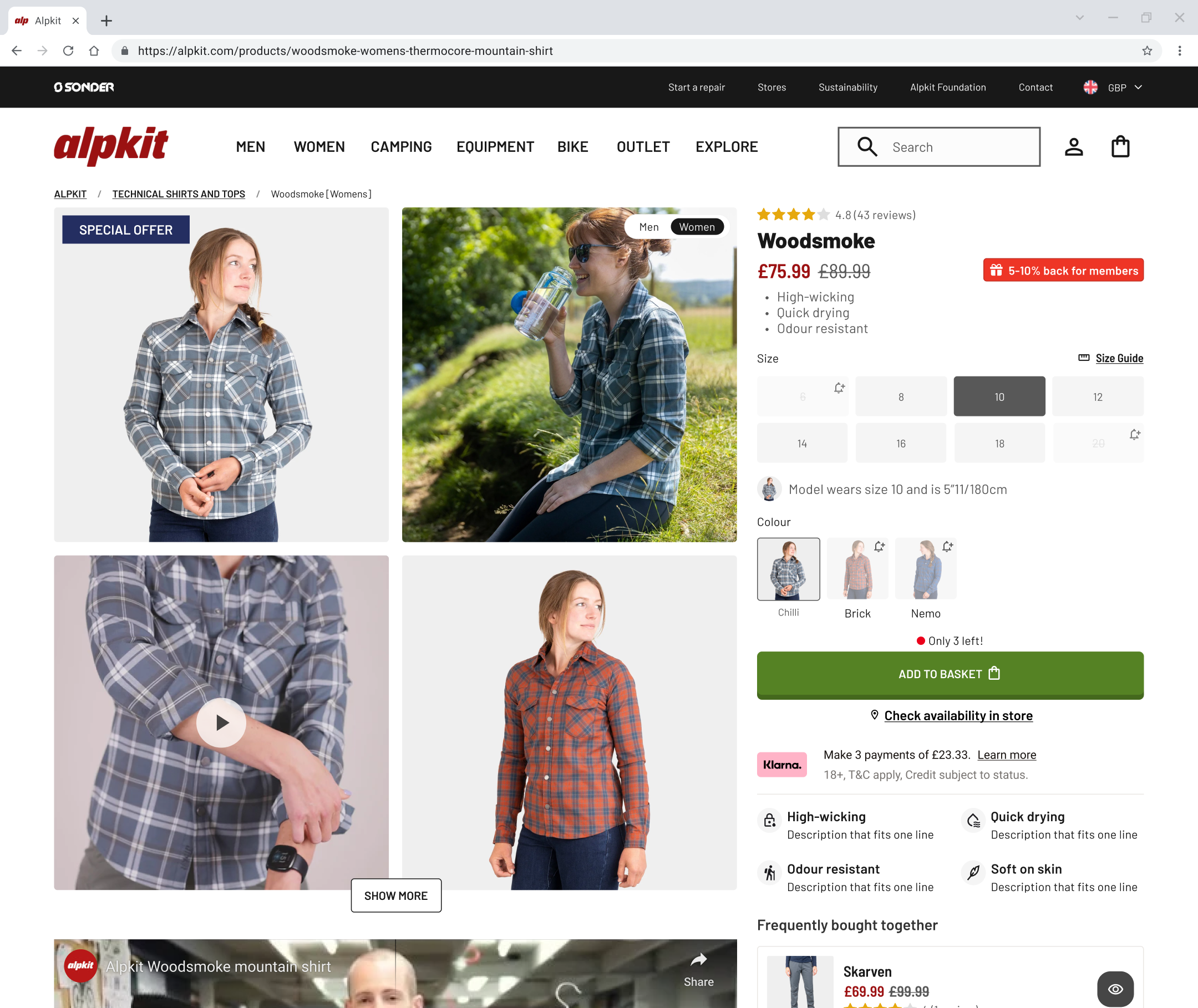 After
After
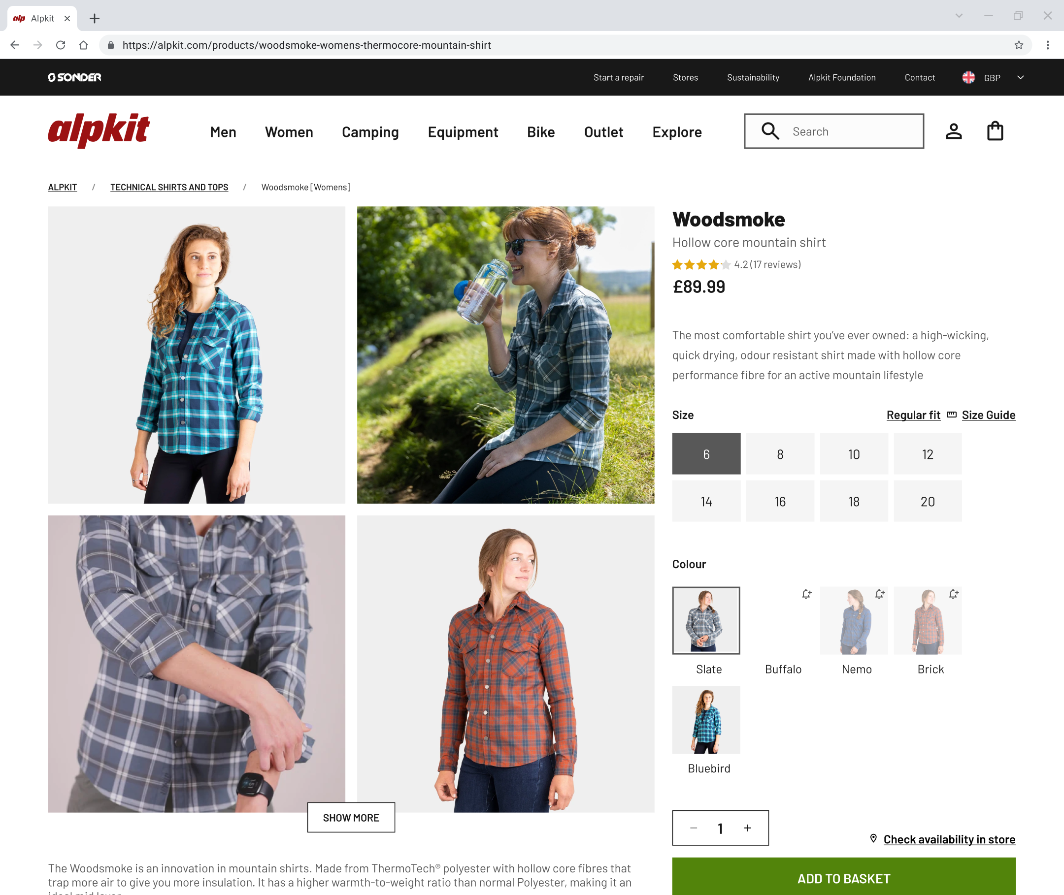 Before
Within a short amount of time, this PDP received the justice it deserved: no more cluttered walls of text, UI impurities and lack of incentives.
Now we've got a PDP that's bringing value to both the customer and the business: they both benefit from the same layout, regardless of the product type, the offers are made salient, the information is easily digestible and the overall experience more engaging.
We had finished a priority task fast and did not compromised the quality of the interface - this was to be presented to the client later by my lead.
Read more of my work
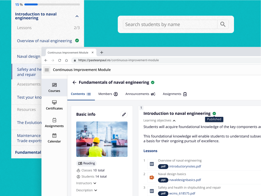
A Learning Platform for a Fortune 500 Company
Spearheaded LMS strategy and design, securing buy-in and funding for future development.
